BAM Chocolate - Checkout re-design
My role
Product Designer - Research, Documentation, UX & UI Design, Stakeholder management
Team
Ervin Prislan, Management
Me, Product Design
Timeline & Status
2 Months, Live
Overview
In Q4 of 2023, BAM Chocolate, a premium Slovenian sweets brand renowned for its high-quality ingredients and diverse product range, sought to revamp its online store's checkout process.
The primary objectives were to boost conversion rates, reduce cart abandonment, increase the average order value (AOV), and optimize the post-checkout experience.
PROBLEM OVERVIEW
BAM Chocolate’s checkout was losing them customers
Problem statements
High cart abandonment – 60% of users dropped off before completing their purchases.
Inconsistent checkout flow – Steps felt disjointed, making the process harder to follow.
UI inconsistencies – The design lacked cohesion, making the experience feel unpolished.
Missed upselling opportunities – No clear way to suggest additional products or bundles.
RESEARCH SUMMARY
Understanding the problem through data
Stakeholder's insights
BAM’s team knew their checkout wasn’t working but weren’t sure what needed to change. Their main goal was simple: build a better checkout experience that would reduce drop-offs and improve sales.
Demographic research
I began by analyzing demographic data to comprehend the shopping behaviors influenced by age, nationality, and gender. This insight was crucial for tailoring the checkout experience to meet user expectations.
The existing checkout flow
A thorough audit of the current checkout process was conducted, during which I identified 28 areas needing improvement. These findings were presented to BAM's team, highlighting potential barriers to conversion.
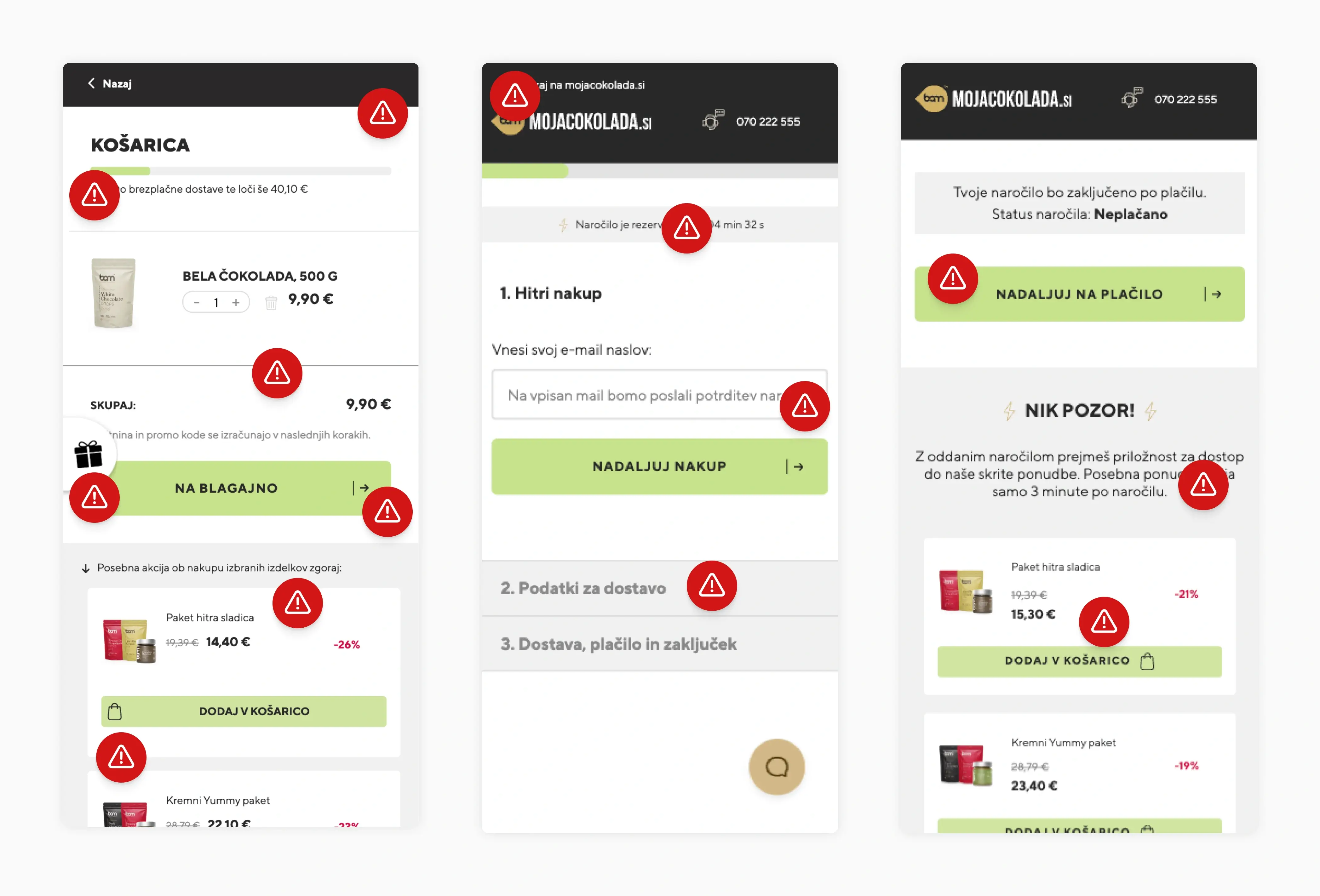
1.0 Audit.
IMAGE
User behavior
I reviewed user data to map out the entire checkout process, identifying areas where users got stuck or abandoned their carts. This analysis confirmed that inconsistencies in the flow were a major issue.
DESIGN EXPLORATION
Balancing simplicity and efficiency
Checkout flow research
Focusing on the Jakob's Law, I examined popular
e-commerce platforms favored by BAM's target demographic. This analysis helped me compile best practices, ensuring the redesigned checkout aligned with user expectations.
Optimizing for mobile-first
Since most users shopped on mobile, I designed the checkout with a mobile-first approach, ensuring it was easy to navigate on smaller screens without unnecessary complexity.
2.0 Mobile wireframes.
IMAGE
Upselling opportunities
To increase the average order value, I integrated upselling options into the checkout. Users were shown complementary products in a non-intrusive way, making additional purchases feel seamless.
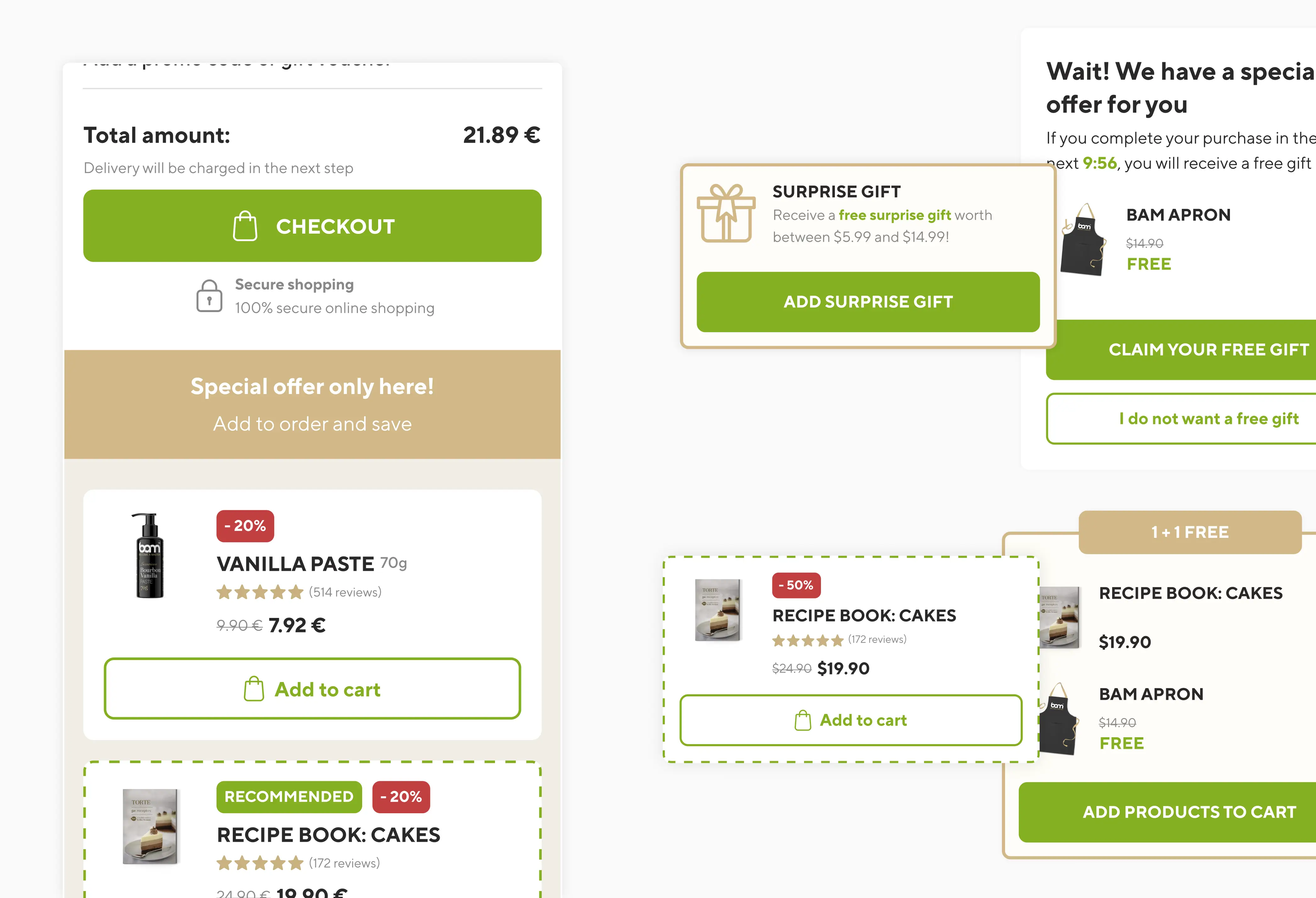
2.1 Upselling examples.
IMAGE
UI DESIGN AND CONSISTENCY
Creating a cohesive visual experience
Unifying the design language
Since BAM had a well defined brand language I fixed the inconsistencies in the old UI that made the checkout feel unpolished and unprofessional. I also introduced basic components to the Figma file, ensuring visual and functional consistency across all checkout elements and any future updates.
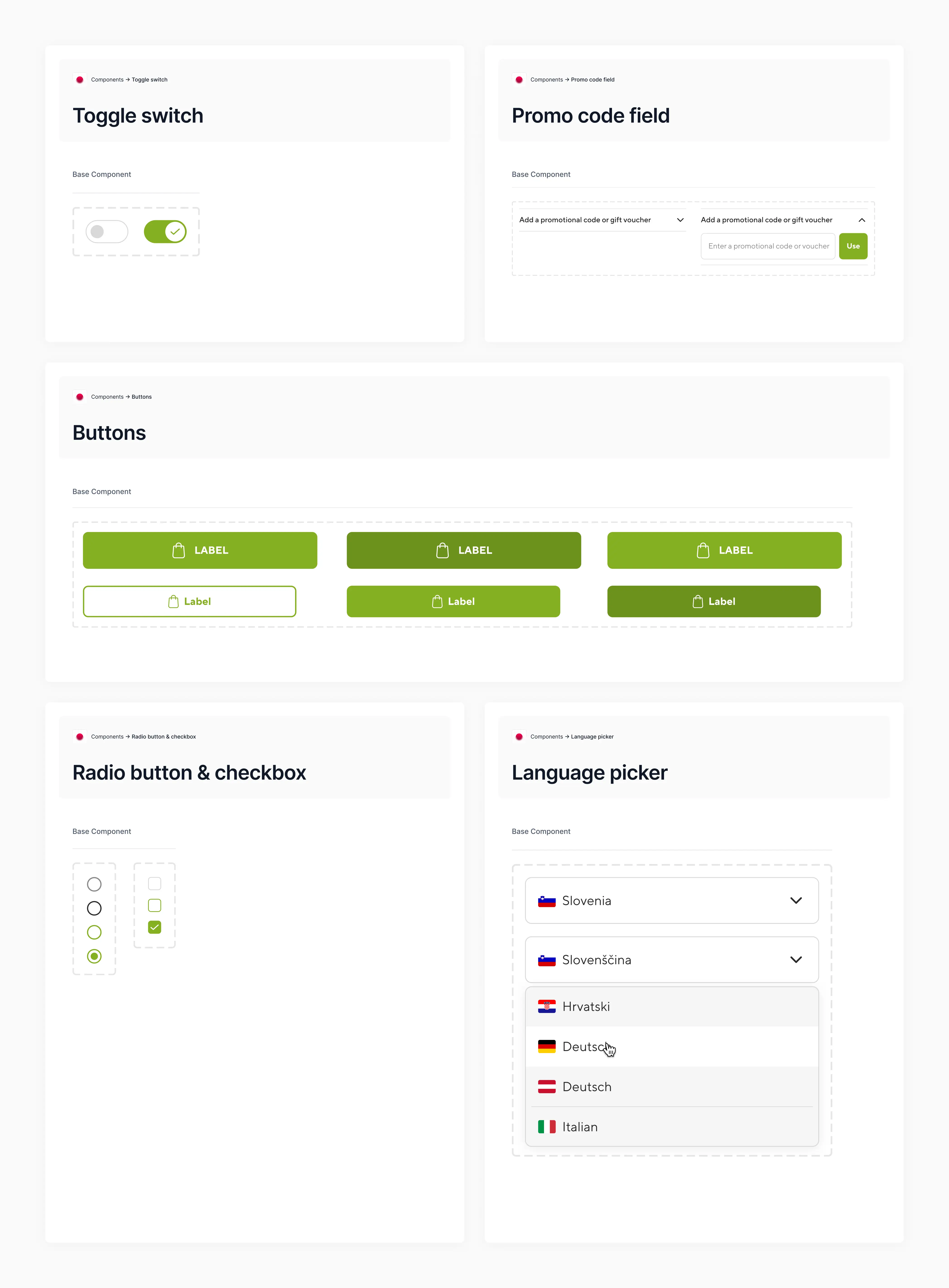
3.0 Components.
IMAGE
Reducing friction in interactions
I focused on making every step of the process feel intuitive. Button placements, input fields, and progress indicators were optimized to reduce hesitation and improve clarity.
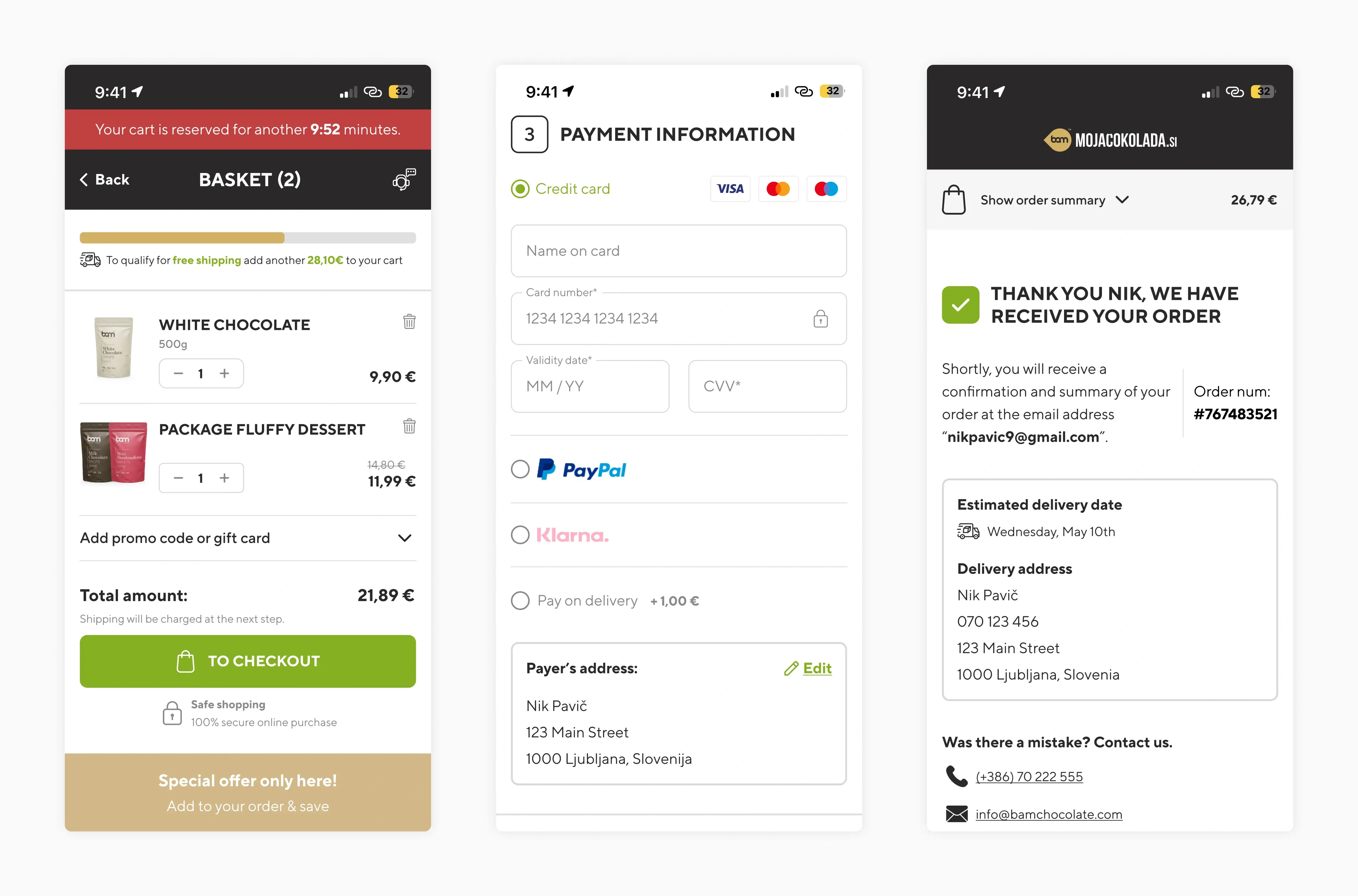
3.1 Checkout flow.
IMAGE
FINAL DESIGNS
A seamless experience
4.0 Final UI.
IMAGE
4.1 Popups UI.
IMAGE
4.2 Desktop cart.
IMAGE
4.3 Desktop checkout.
IMAGE
4.4 Desktop post-checkout.
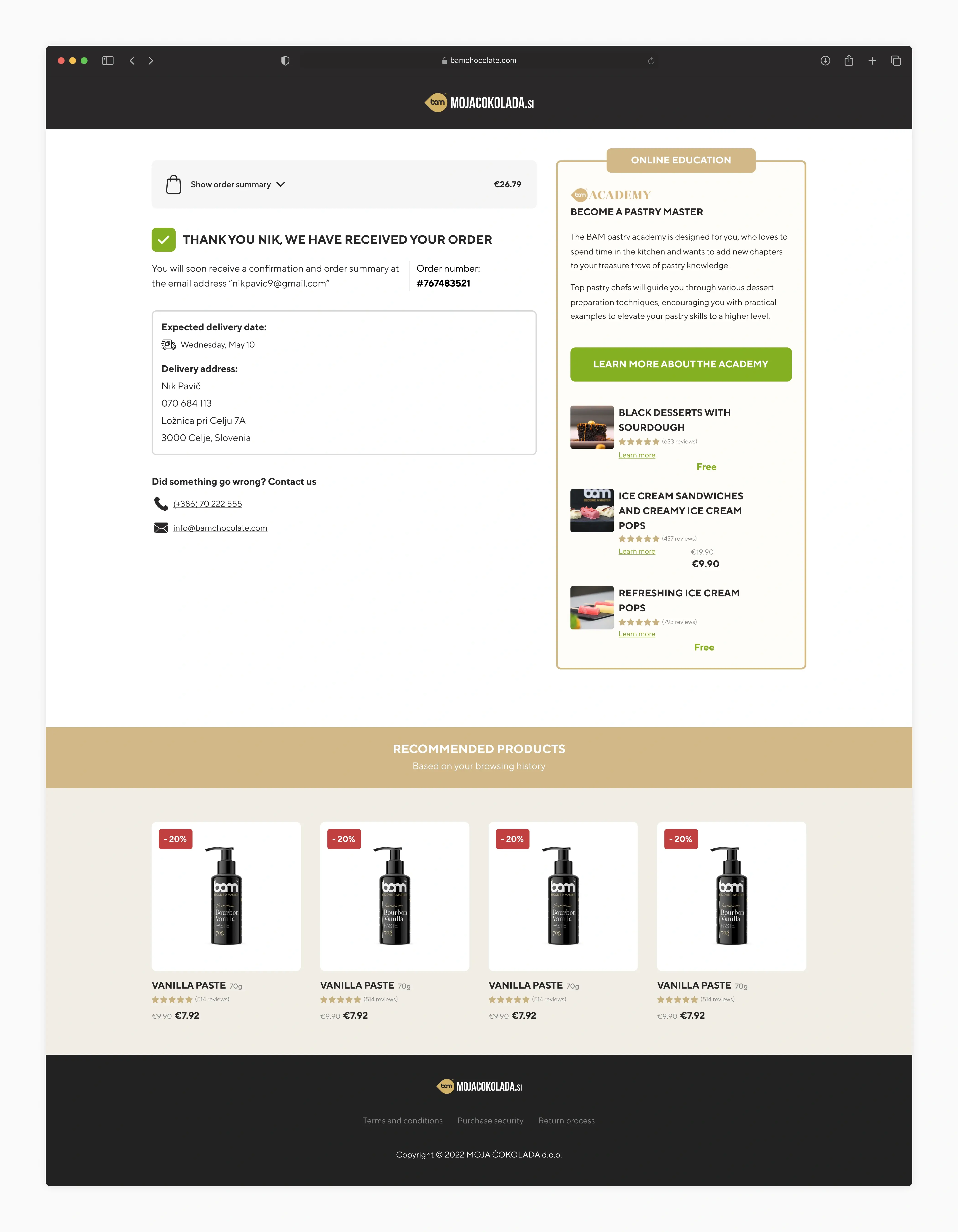
IMAGE
IMPACT AND LEARNINGS
Measuring success and takeaways
Results
Drop-off rate decreased from 60% to 34% – The new checkout reduced friction, making it easier for users to complete their purchases.
Average order value increased by 26% – Upselling opportunities were introduced at key moments, leading to higher-value transactions.
Learnings
Consistency matters – A polished UI builds trust and minimizes friction, leading to a smoother shopping experience.
Mobile-first was key – Designing for the dominant platform ensured accessibility and usability across all devices.
Simplicity leads to better conversion – A structured, intuitive flow gives users confidence to complete their purchases.
Available to work with you
Let’s design the
next one together

© 2025 Nik Pavič
Ljubljana, Slovenia