Outift7 - Dashboard Design
My role
Product Designer - Design system, Research, Documentation, UX & UI Design, Prototyping
Team
Jan Šušteršič, PM (Outfit7)
Denis Rajković, PM (Outfit7)
Ervin Prislan, Management
Me, Product Design
Timeline & Status
6 Months, Live
Overview
Outfit7 was in need of a rework of their CRM web app that enables their team to collaborate more efficiently, keep track of their products, manage testing sessions, and organize configuration documents.
I focused on refreshing the UI, implementing new features, and creating a scalable design system that could accommodate future needs for new dashboards.
The results were three complete sets of dashboards complemented by a full design system. The redesign was rigorously evaluated through rounds of user testing involving Outfit7’s employees. The new CRM was widely praised by everyone who used it.
PROBLEM OVERVIEW
Outfit’s creativity was being held back
Problem statements
The overall experience of the current product was draining and felt time-consuming.
Some user groups felt disconnected from the app, as their workflows and processes differed.
Only a portion of Outfit7’s existing teams had their own custom dashboard.
The current UI was inconsistent and outdated, making it unpleasant to work with.
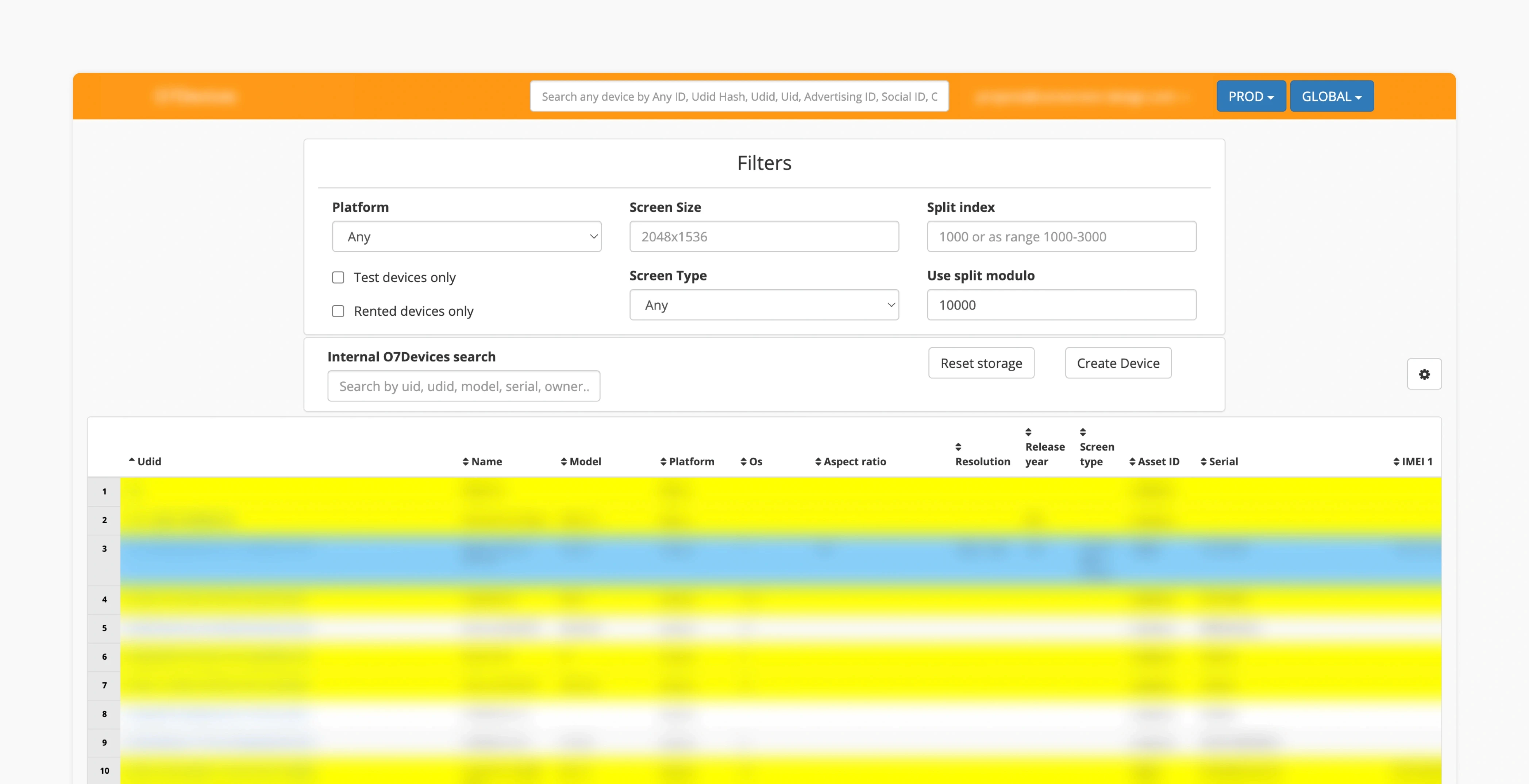
1.0 Old design.
IMAGE
RESEARCH SUMMARY
Clearing the fog - understanding multiple teams
Outfit7 is a mature company with over 400 employees. The specific subsidiary we collaborated with comprised diverse teams, including developers, QA engineers, designers, and legal experts. To create a meaningful solution, it was essential to understand their unique challenges and workflows.
Different teams, different needs
Developers value clear communication in technical terms.
All teams required data to be displayed transparently and clearly.
Higher technical expertise often correlated with the app’s complexity.
The need for customizability was high due to varying team priorities.
What it all leads to - the North Star principles
Adaptability – Accommodate the full spectrum of users, workflows, and priorities.
Informative at a glance – Make data easier to understand with minimal effort.
Productivity first – Maintain a minimal, productive UI that prioritizes simplicity.
Easily expandable - Setting up grounds for a expanding, complex system.
LAYOUT PATTERNS
Working with a data-heavy interface
Common region & proximity:
To emphasize scannability, we separated navigation from the dashboard contents. Navigation was positioned on the left side of the screen, while the adaptable content area expanded to the right.
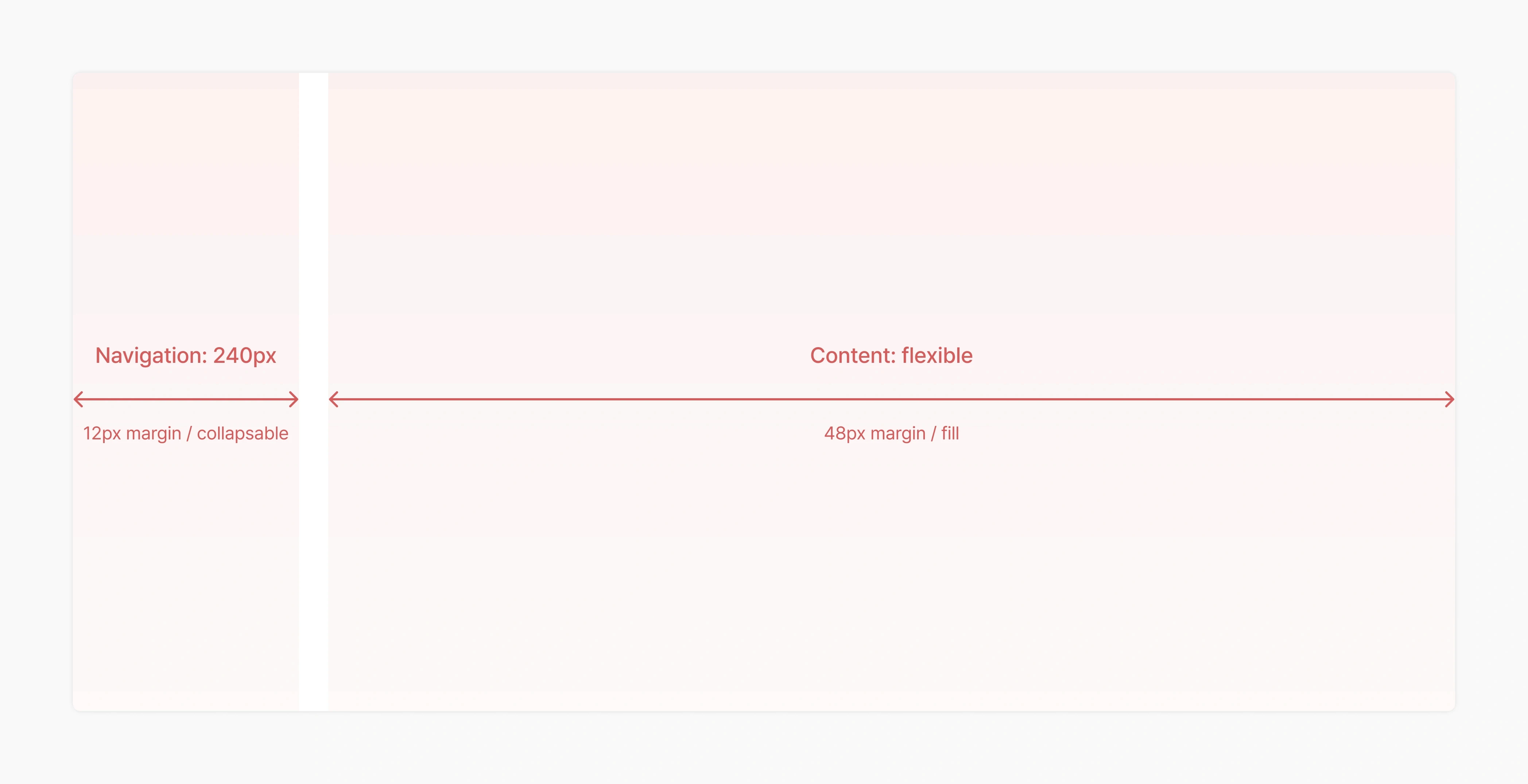
2.0 Content separation.
IMAGE
Column system:
Content was divided into one, two, or three columns depending on the context. This ensured that each type of data was presented optimally, improving readability. The system also allowed us to combine columns as needed, covering edge cases for single, double, or triple-column layouts on the same screen.
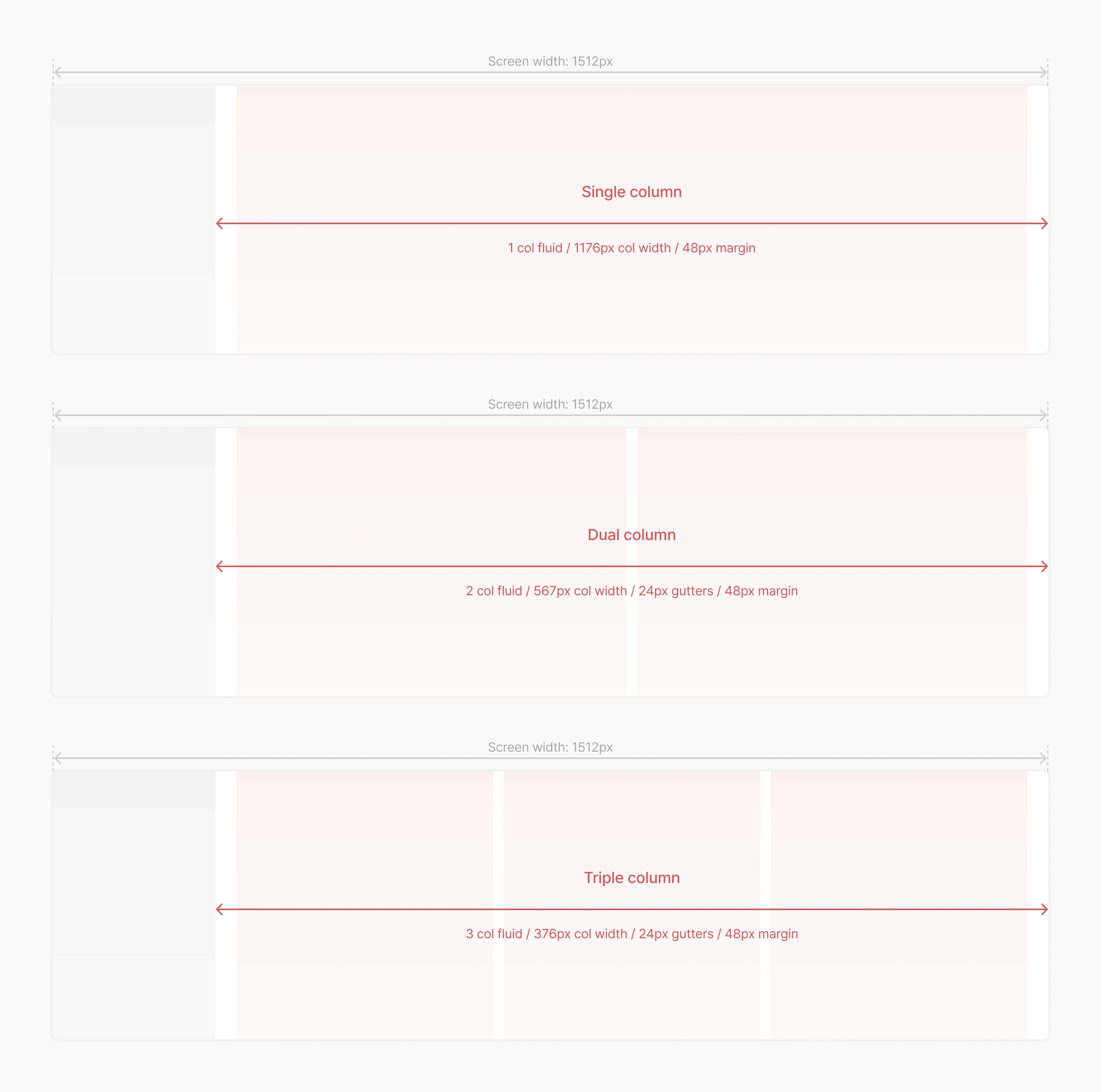
2.1 Content column system.
IMAGE
Data visualization:
The dashboards were designed to clarify and streamline data visualization. Each data type was encapsulated in individual modules, such as bento cards, which ensured clarity and adaptability. This modular approach, combined with customizable layouts, provided maximum flexibility and usability.
2.2 Modular data approach.
IMAGE
DATA VISUALIZATION
Simplifying complex tables and data sets
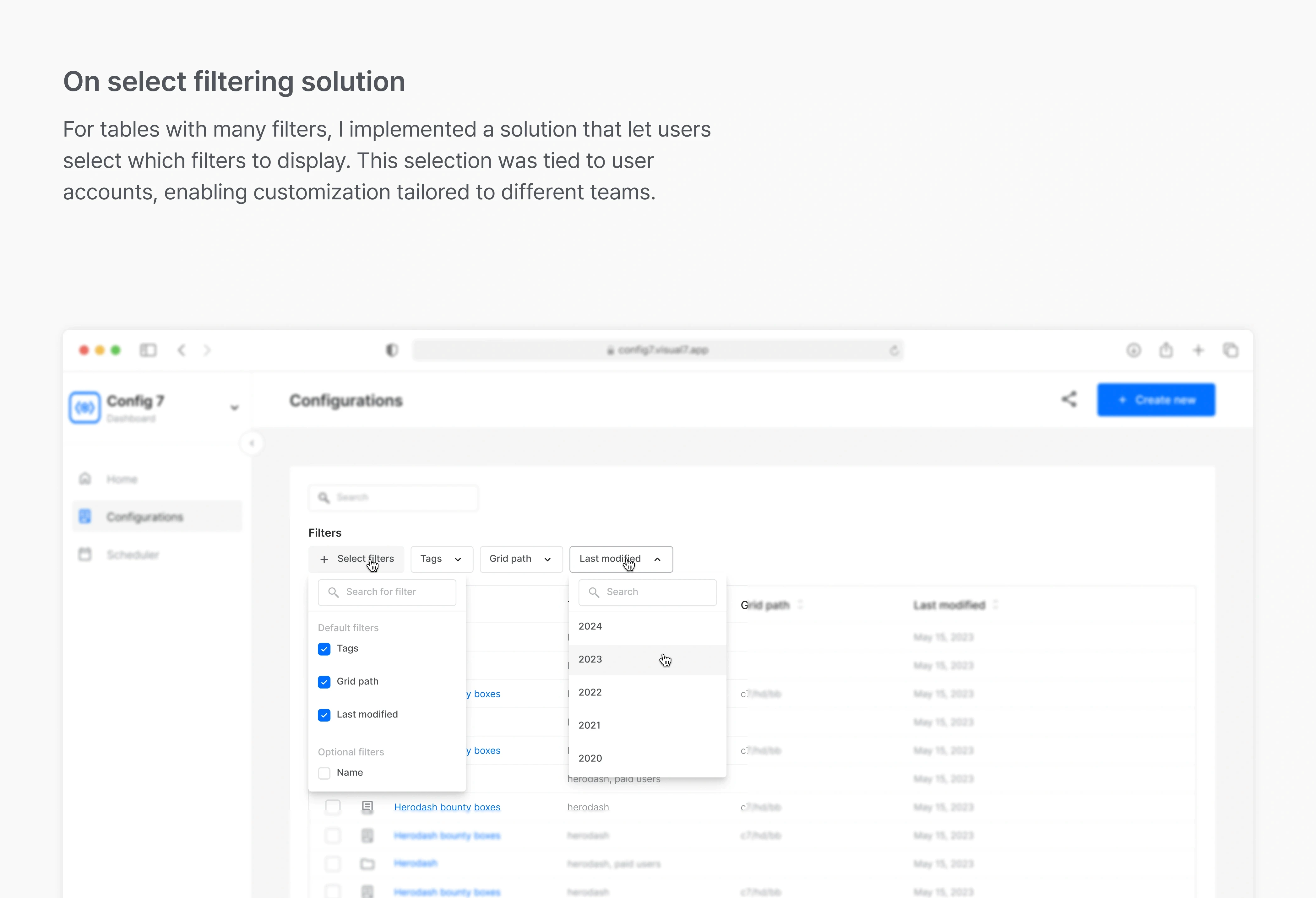
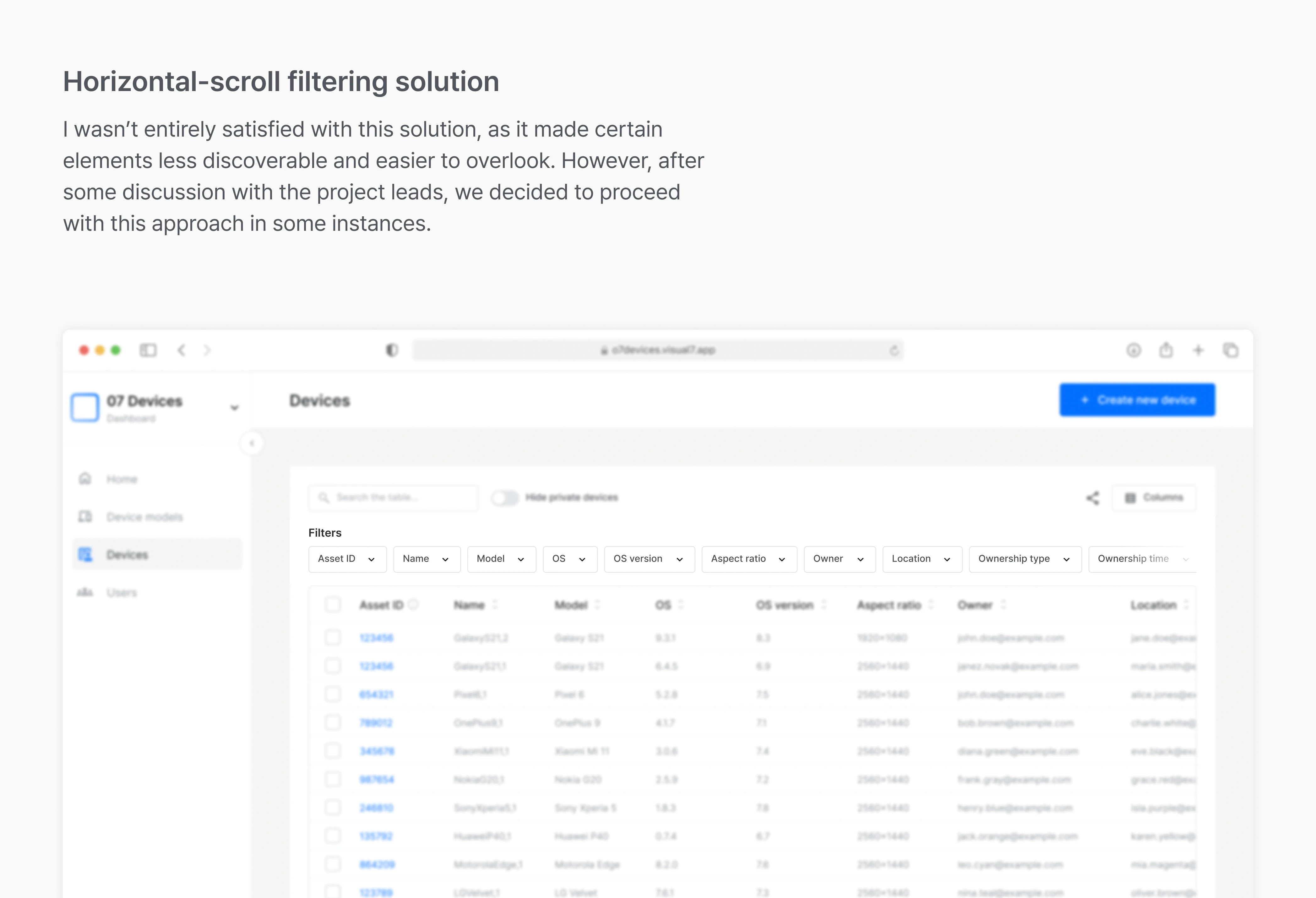
Filtering and sorting:
The filtering solution was designed to balance flexibility and simplicity. With the need to handle a variety of filters across different dashboards and tables, I explored three main approaches: Complex, On select, and Side-scroll.
Complex provided the most flexibility but was challenging to use and implement.
On select offered a balanced approach, being both user-friendly and flexible.
Horizontal-scroll was the simplest to implement but struggled with scalability when dealing with numerous filters.
Ultimately, we adopted a hybrid approach: using the On select option for dashboards with extensive filtering requirements and the Horizontal-scroll option where fewer filters were needed.
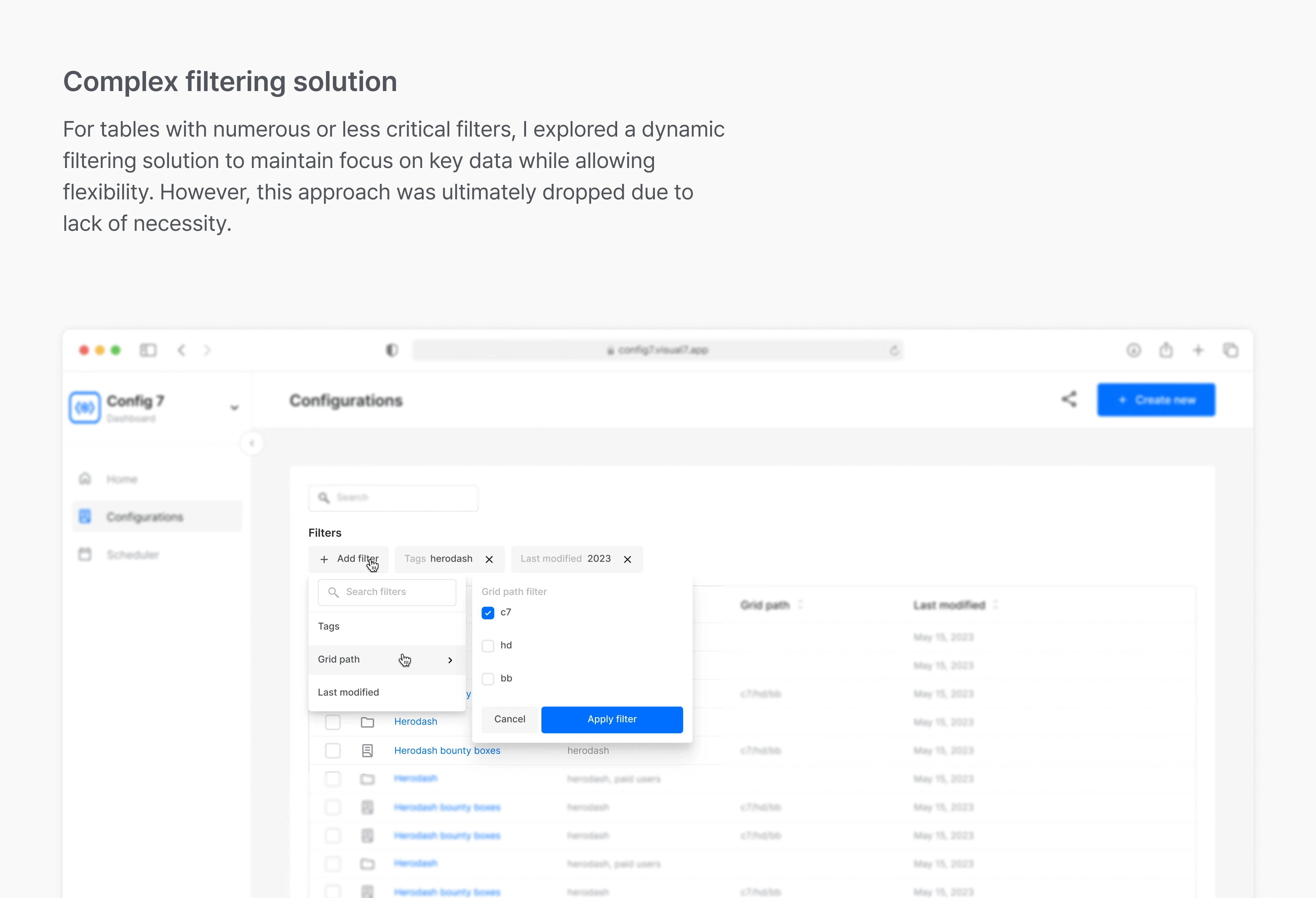
3.0 Complex filters.
IMAGE
3.1 On select filters.
IMAGE
3.2 Horizontal scroll filters.
IMAGE
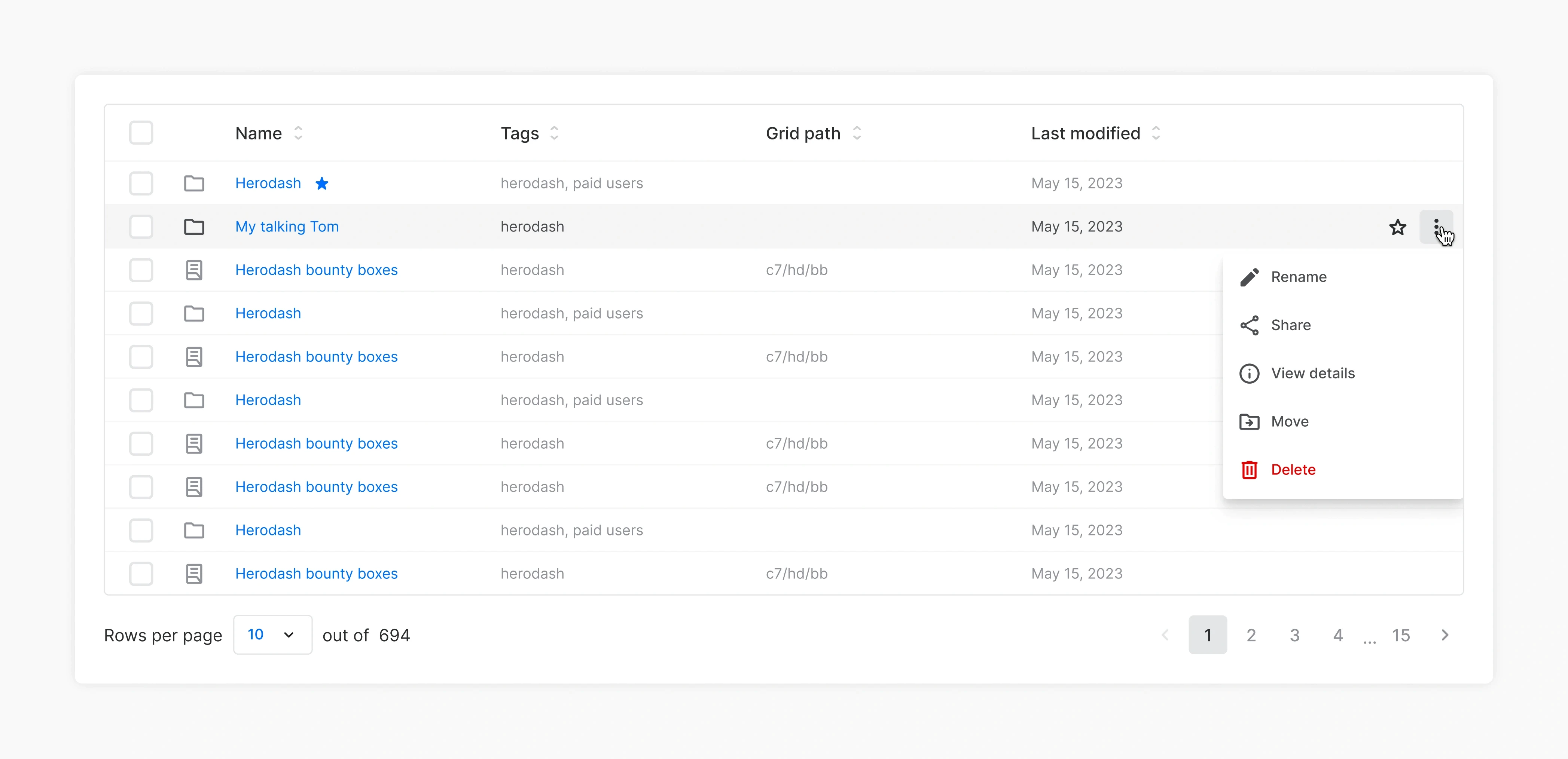
Table rows:
Each table row is interactive, allowing users to perform actions such as renaming, sharing, or expanding to reveal further details. This approach ensures that even data-heavy interfaces remain manageable and approachable, with a strong emphasis on scannability and user engagement.
4.0 Table row.
IMAGE
OPTIMIZED CREATION FLOWS
Streamlining multi-step workflows
To address the challenge of structuring flows for creating and adding new elements to the system, such as AB tests or new devices, I focused on breaking down complex multi-step processes smaller more manageable tasks.
Information architecture:
Recognizing the complexity of these flows, I started by grouping related data sets and distributing them into distinct steps. This segmentation helped maintain clarity and provided users with a concise focus at each stage, creating a better perception of progress.
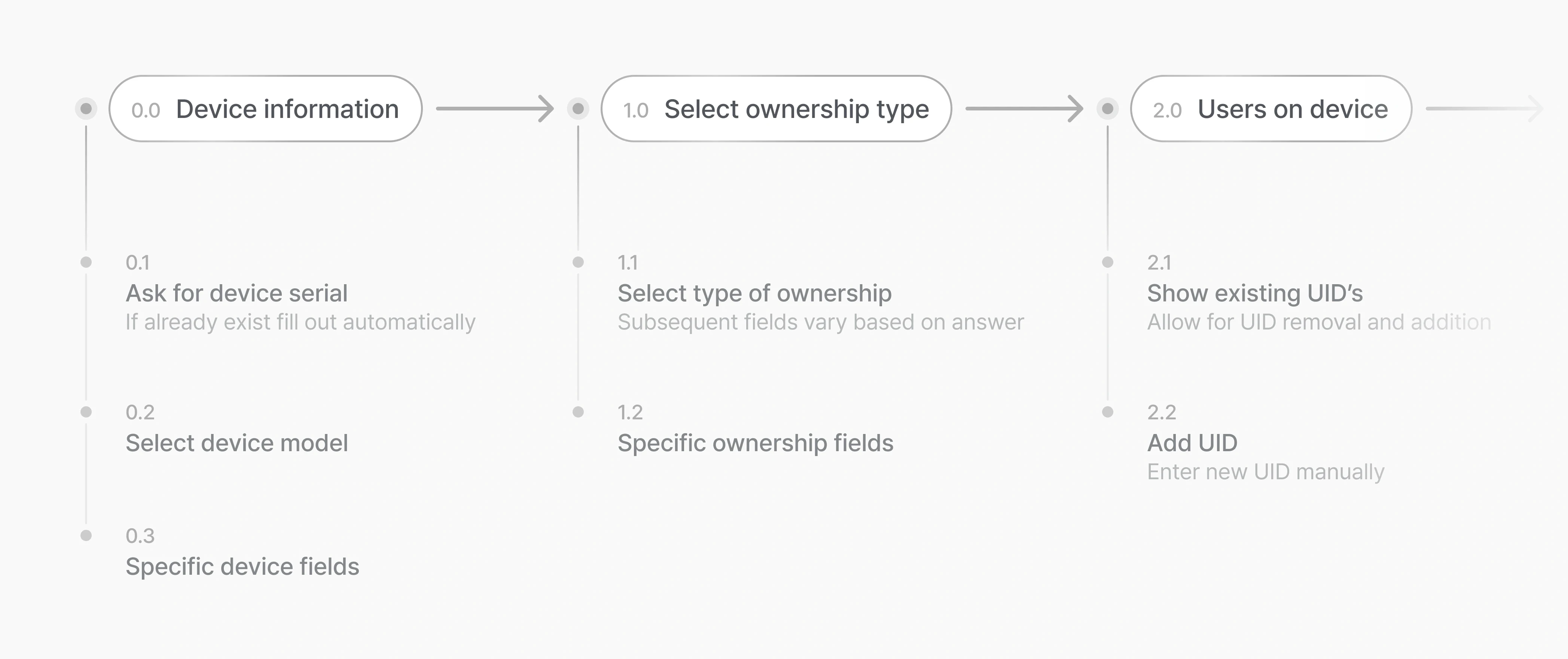
5.0 Updated flow.
IMAGE
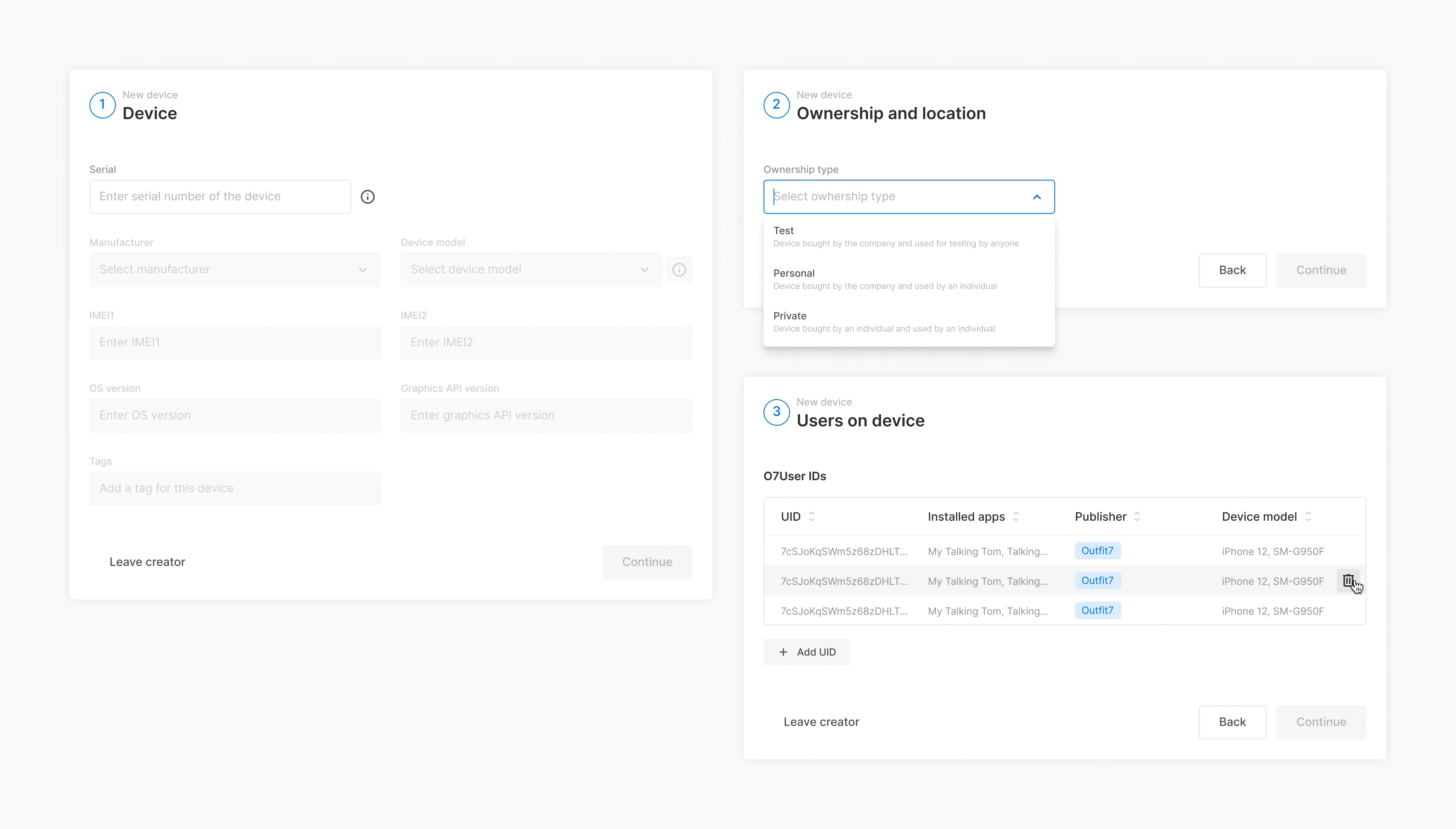
Dedicated workflow pages:
To avoid overwhelming users, the content for these flows was placed on separate pages, away from other content. This decision reduced cognitive overload and allowed users to concentrate solely on the task at hand without distractions.
5.1 Dedicated workflow pages.
IMAGE
Transparency:
A step tracker was introduced to provide immediate visibility into the entire process. Users could see all required steps at a glance, offering transparency and reducing any uncertainty about the workflow.
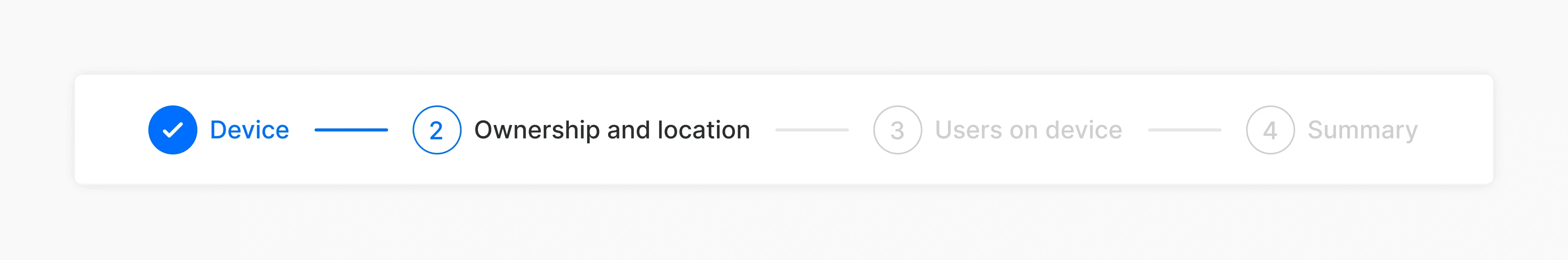
5.2 Step tracking.
IMAGE
Summary pages:
To minimize errors and unnecessary backtracking, I added a summary page to each flow. This page allowed users to review their inputs and see how the creation would appear in the dashboard once completed. This feature ensured greater confidence before submission.
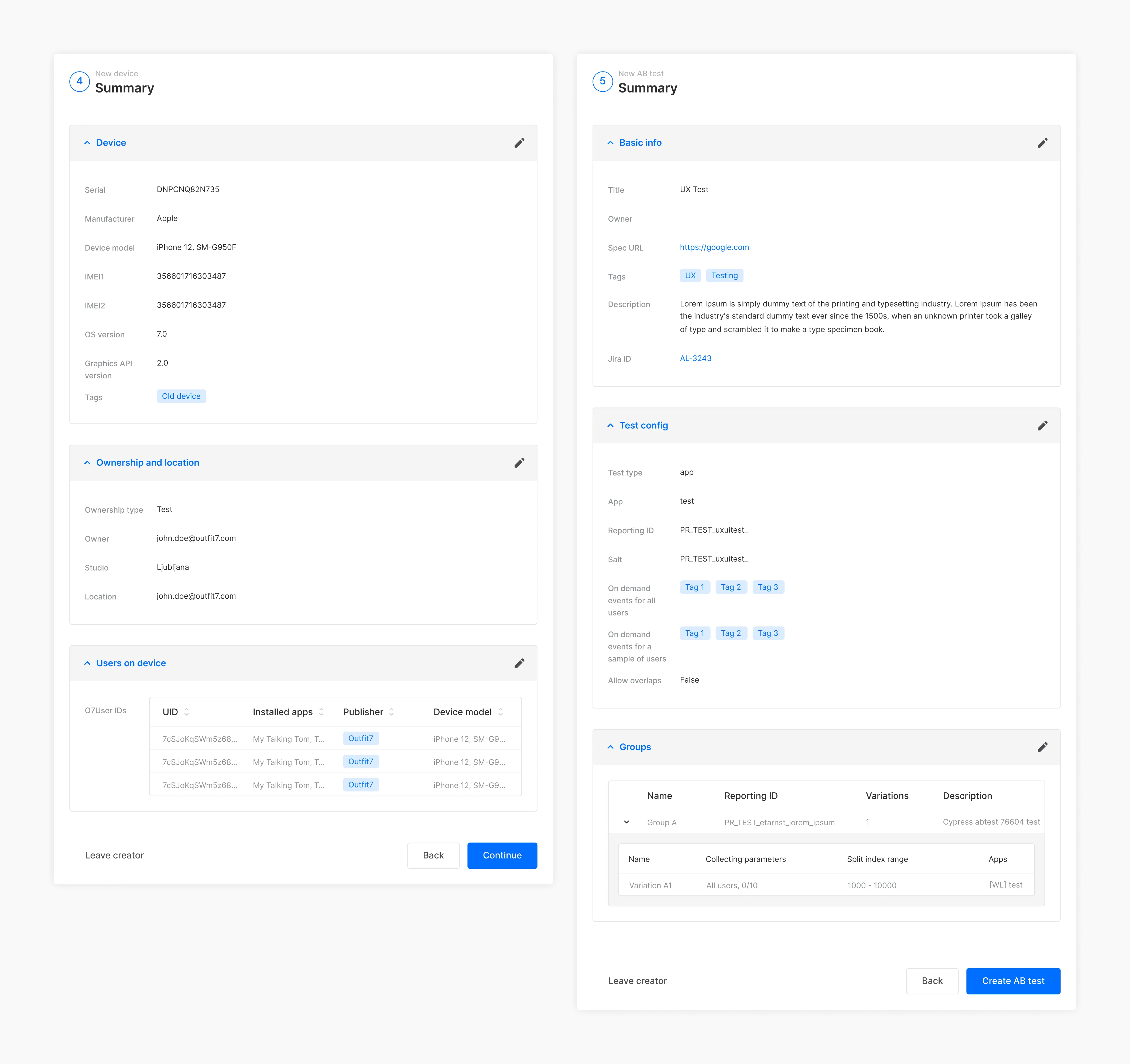
5.3 Summary pages.
IMAGE
Data validation:
Given the complexity of some flows, I implemented modals and indicators to alert users of missing or incorrect data. These validations were designed to be prominent and required confirmation, ensuring that users didn’t inadvertently lose data or proceed with incomplete information.
VISUAL DESIGN AND DESIGN SYSTEM
Creating harmony across dashboards
We redesigned Outfit7’s CRM with a clear goal: creating a unified system to ensure consistency across multiple dashboards. Many users relied on several dashboards, so it was critical to deliver a cohesive, intuitive experience that felt seamless no matter which dashboard they were using.
Why a design system?
The decision to build a design system stemmed from the need to maintain uniformity in both appearance and functionality across various interfaces. This approach also ensured scalability as new dashboards and features were introduced.
Approach:
I leveraged atomic design principles to create modular components that could adapt to diverse use cases while maintaining consistency. The colorful palette, inspired by Outfit7’s branding, was adjusted and used sparingly to balance vibrancy with usability. This ensured that the interface remained professional while retaining the brand’s distinct personality.
Problem statements
Reusable Components – Modular elements like buttons, input fields, and cards ensured uniformity and reduced development effort.
Adapted Color Palette – A refreshed palette that harmonized with the brand identity while enhancing readability.
Typography System – A structured typographic hierarchy for better information clarity and prioritization.
Comprehensive Documentation – Detailed guidelines for developers, ensuring seamless integration and clear design standards.
Impact:
The updated UI introduced a clean, modern aesthetic characterized by ample white space, streamlined layouts, and subtle interactive elements. By grounding the visual design in Outfit7’s unique identity, the new system achieved an ideal balance between usability and brand alignment, making the CRM more engaging and effective for its users.
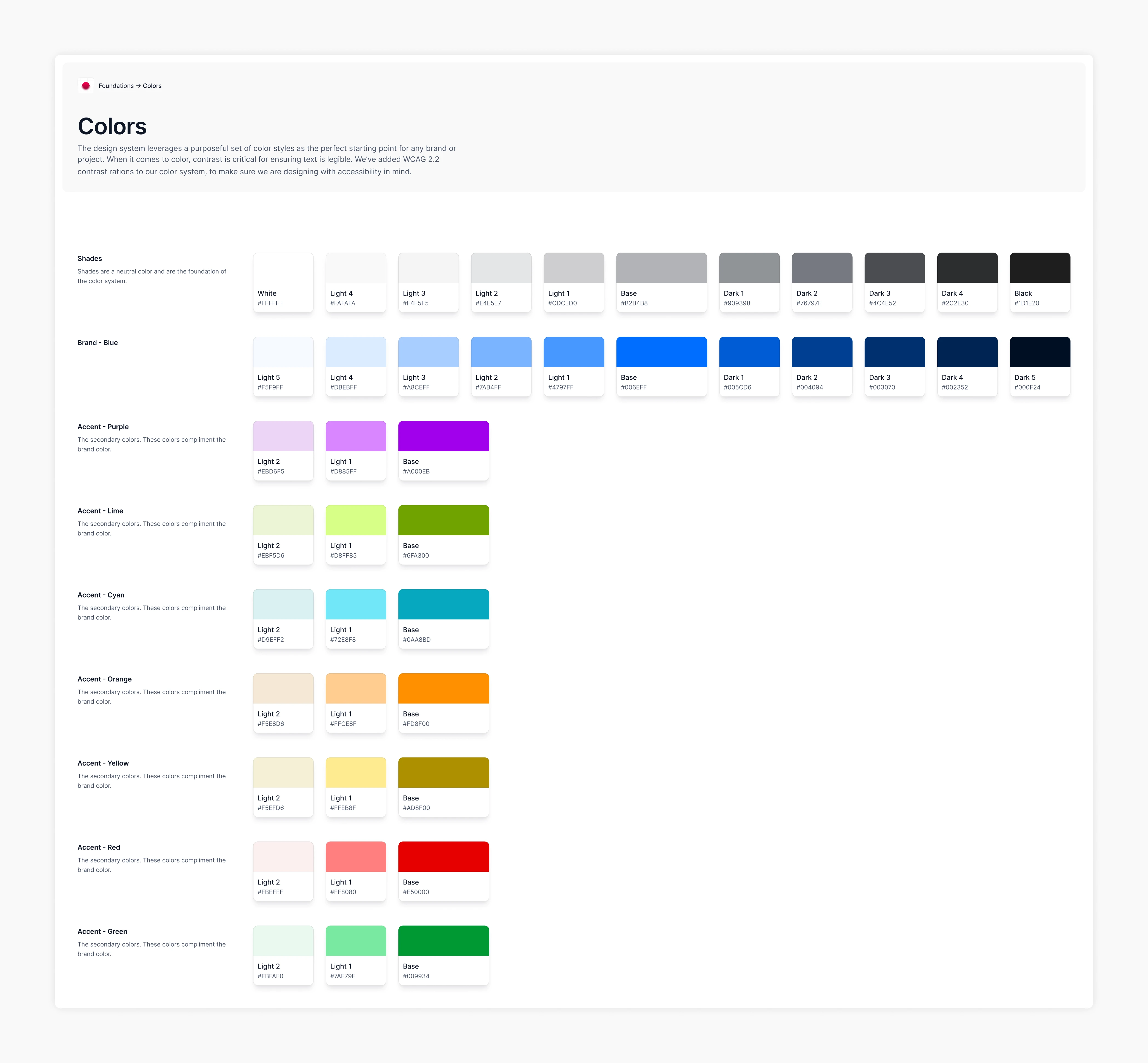
6.0 Color palette.
IMAGE
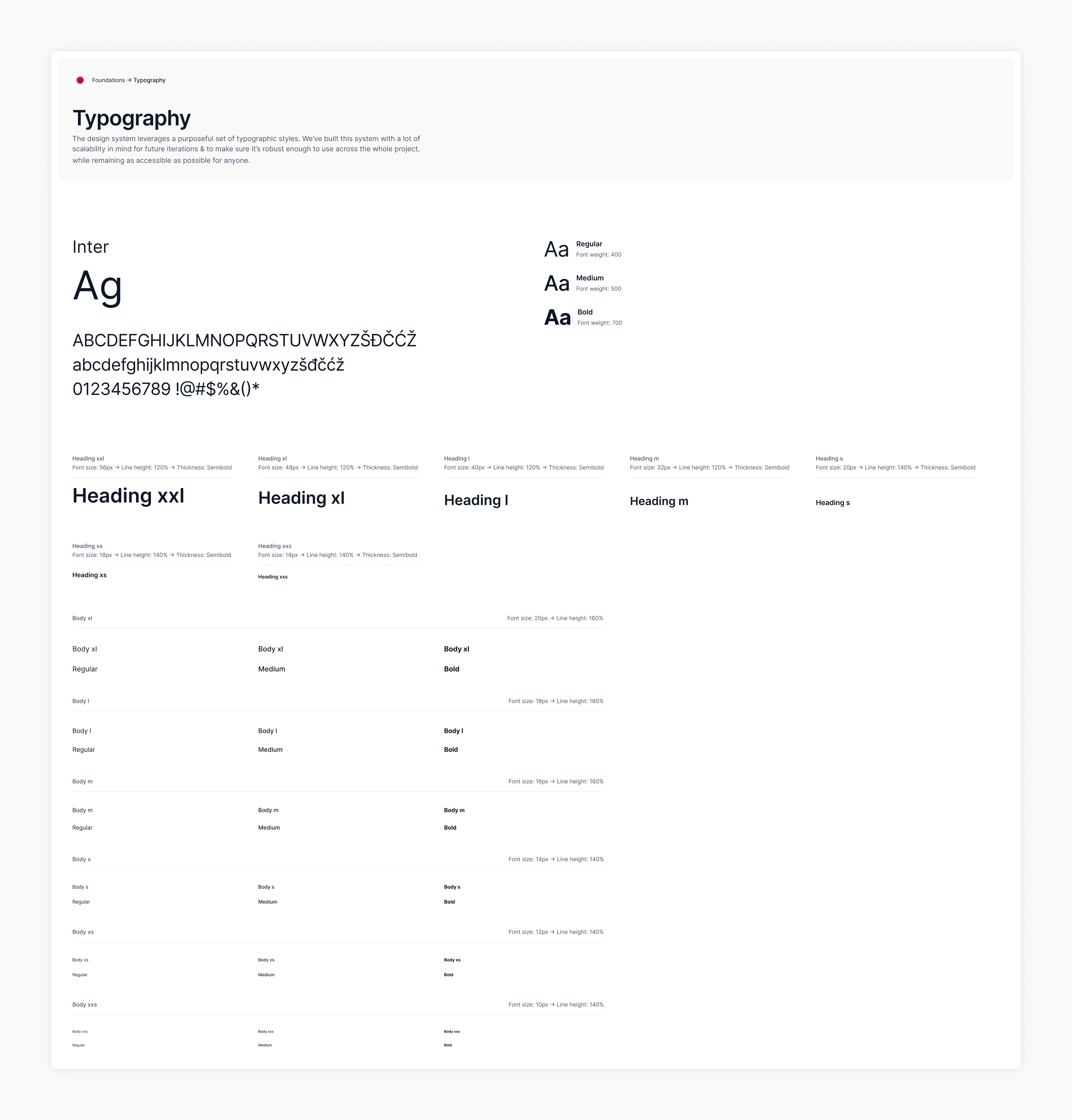
6.1 Typography styles.
IMAGE
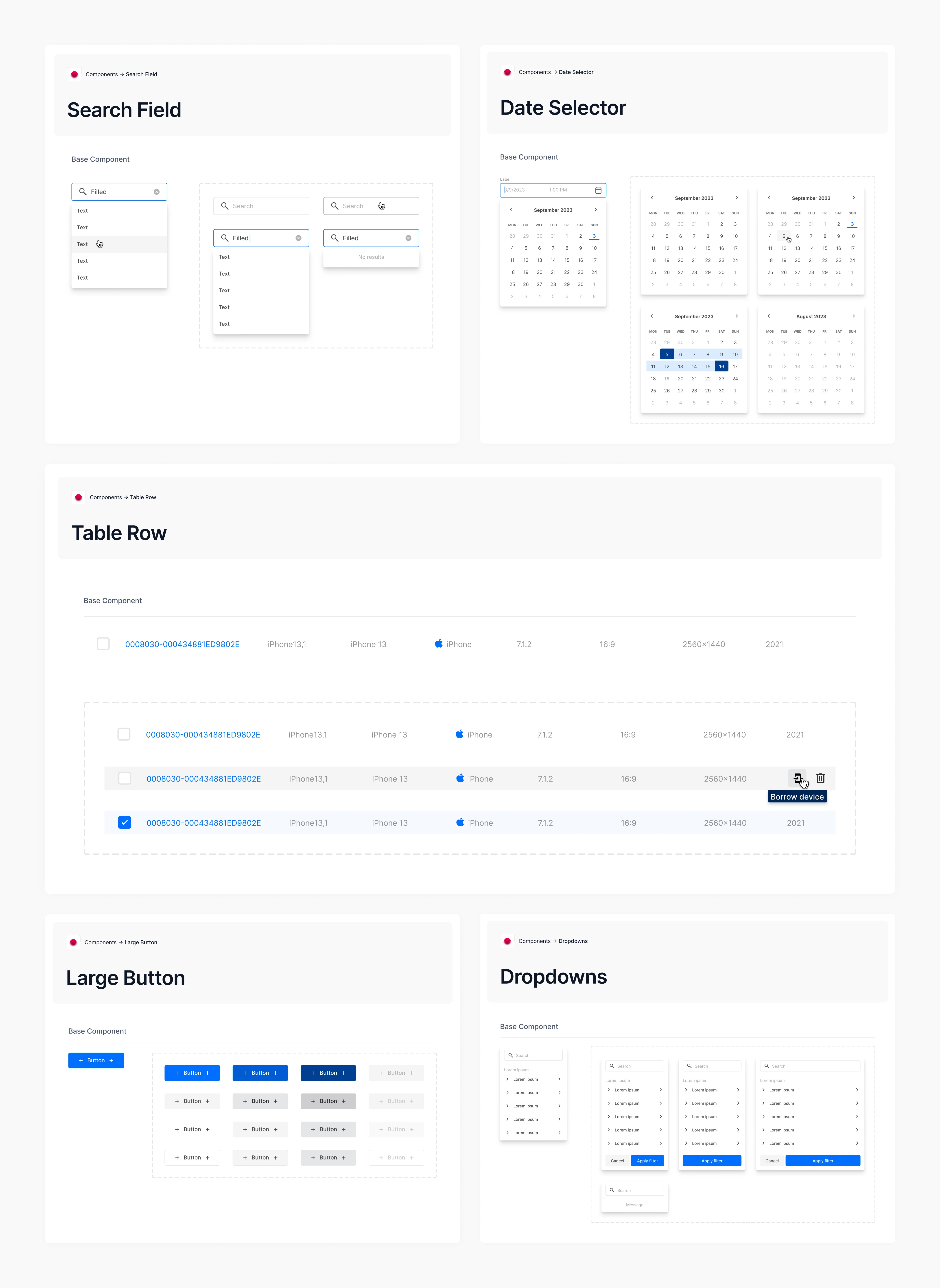
6.2 Components.
IMAGE
USER TESTING
Validating the experience before development
To ensure the new dashboards would meet user needs, I conducted user testing sessions with QA engineers, the primary users of the system. Two engineers volunteered for the testing.
Testing process:
I prepared two tasks for the participants, designed to address five specific objectives. These tasks aimed to evaluate the usability of the new flows and identify any potential issues.
Key results:
Both testers completed the tasks successfully with only minor assistance. They avoided critical errors and completed the tasks within an acceptable time frame. This allowed me to focus on the areas where they required minor help.
Findings:
Through this process, I documented 12 findings in a Notion document and reviewed them with the team. Based on this review, we implemented changes where necessary. After incorporating the updates, the designs were re-evaluated by the team and approved for development without any complaints.
FINAL DESIGNS
A seamless experience
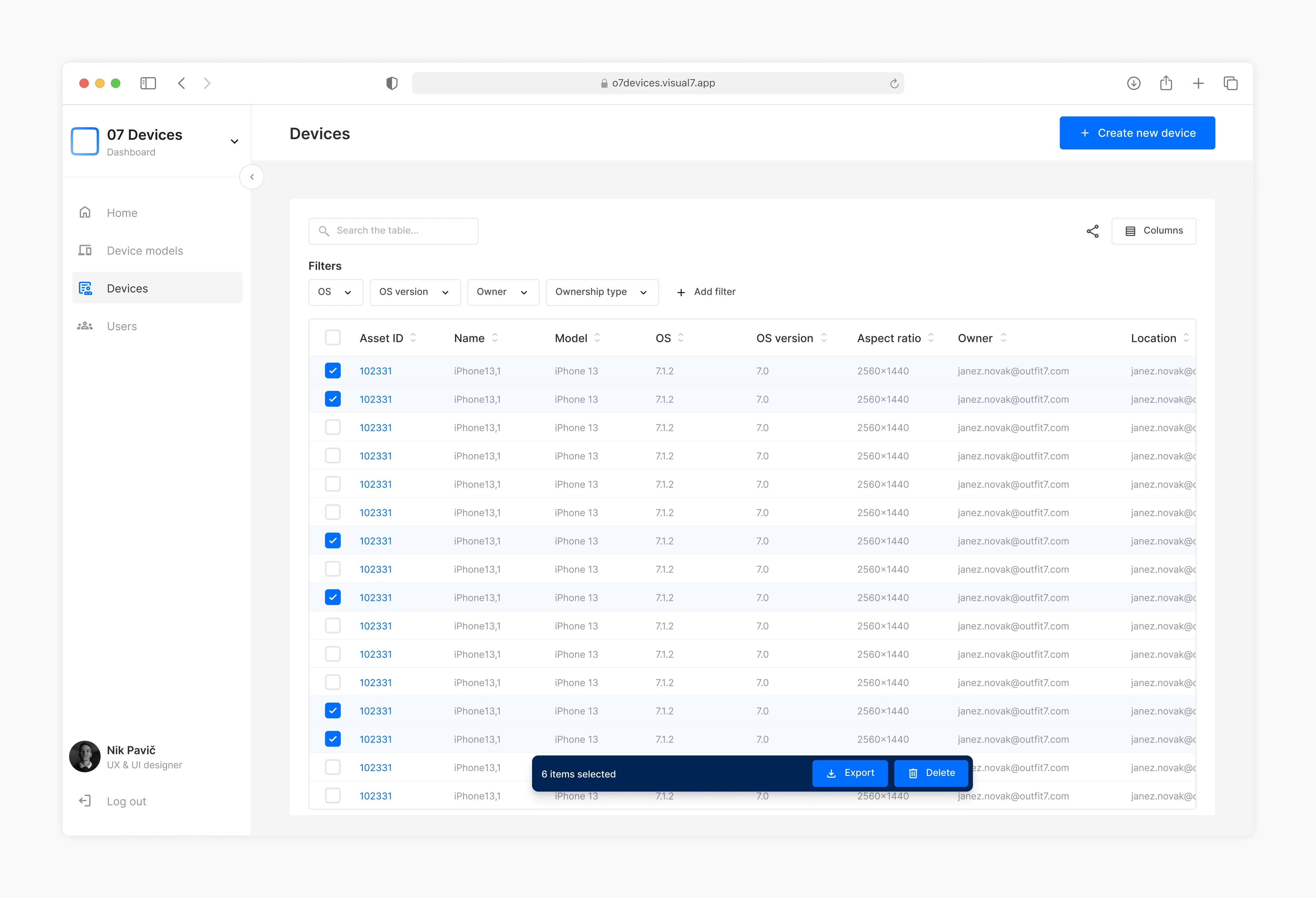
7.0 Table bulk actions.
IMAGE
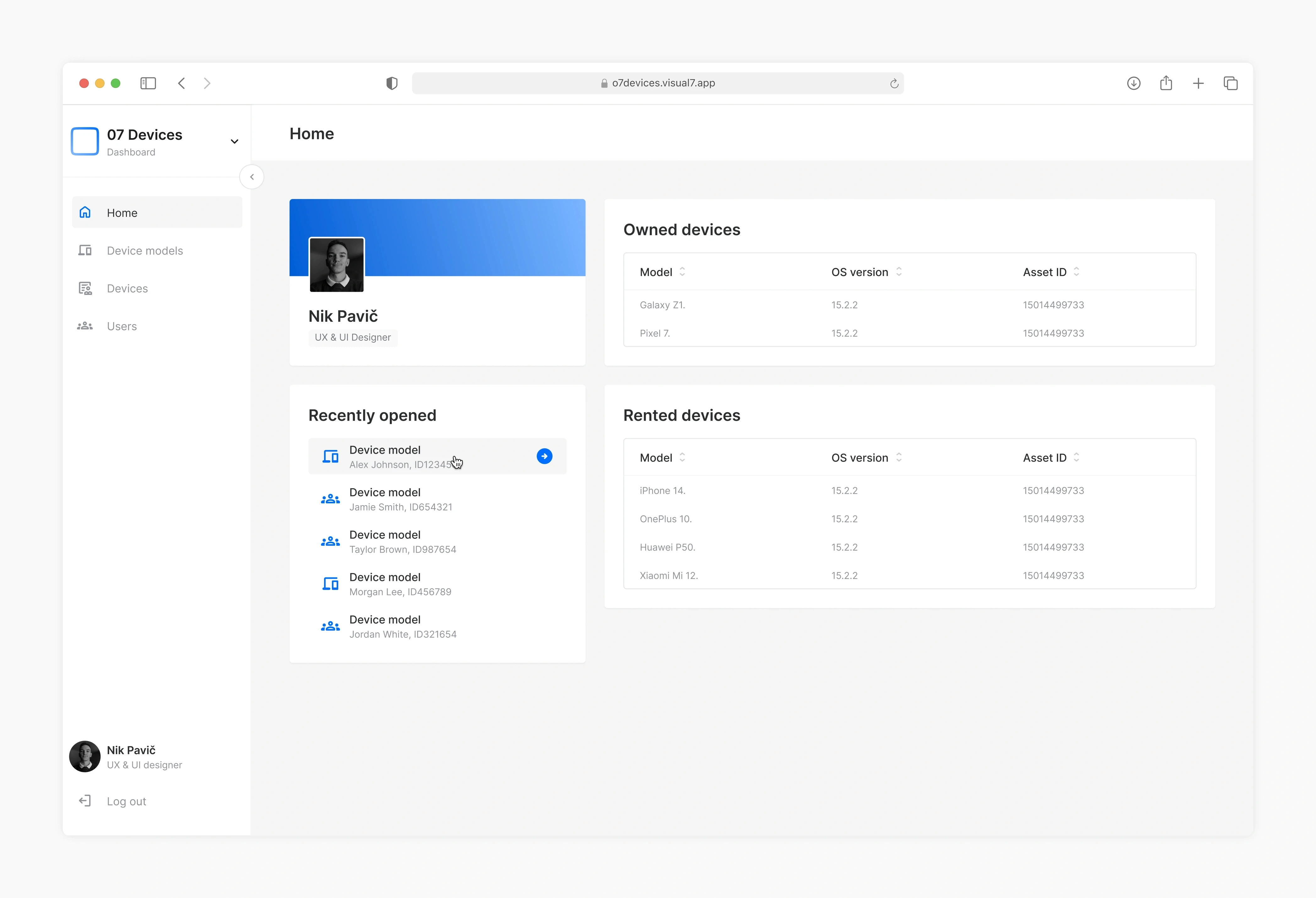
7.1 Home page.
IMAGE
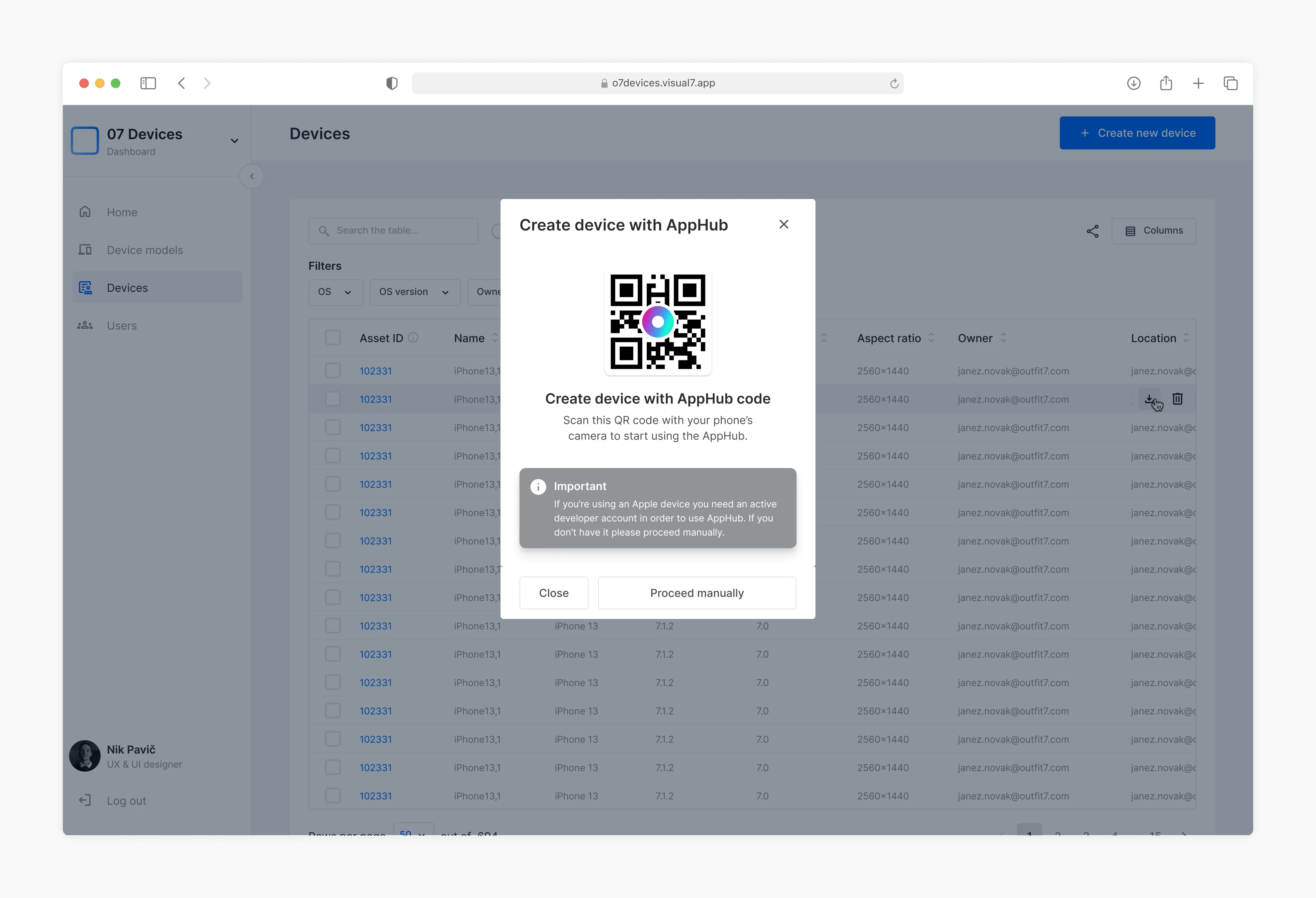
7.2 Device creation flow start.
IMAGE
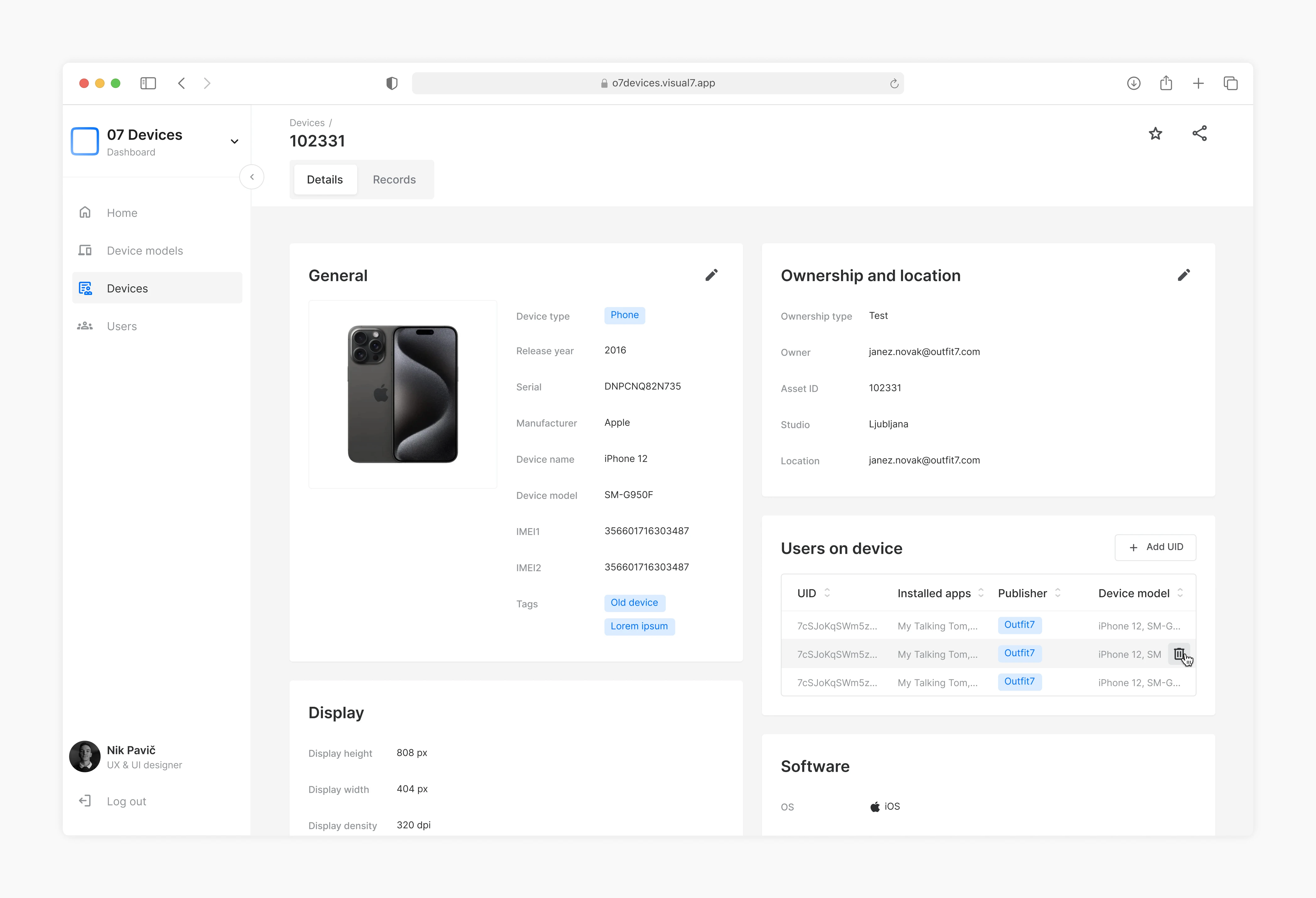
7.3 Device details.
IMAGE
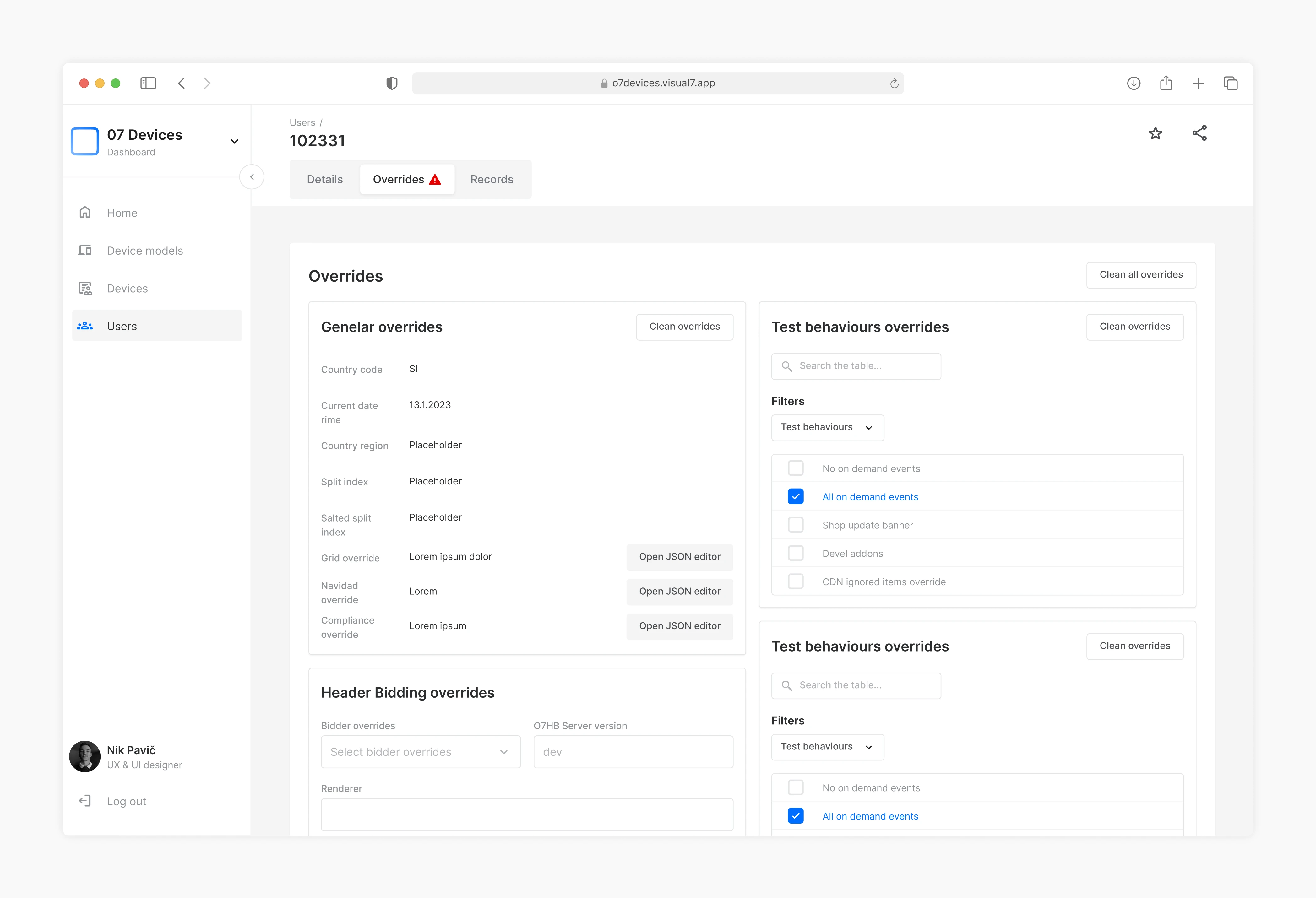
7.4 User overrides.
IMAGE
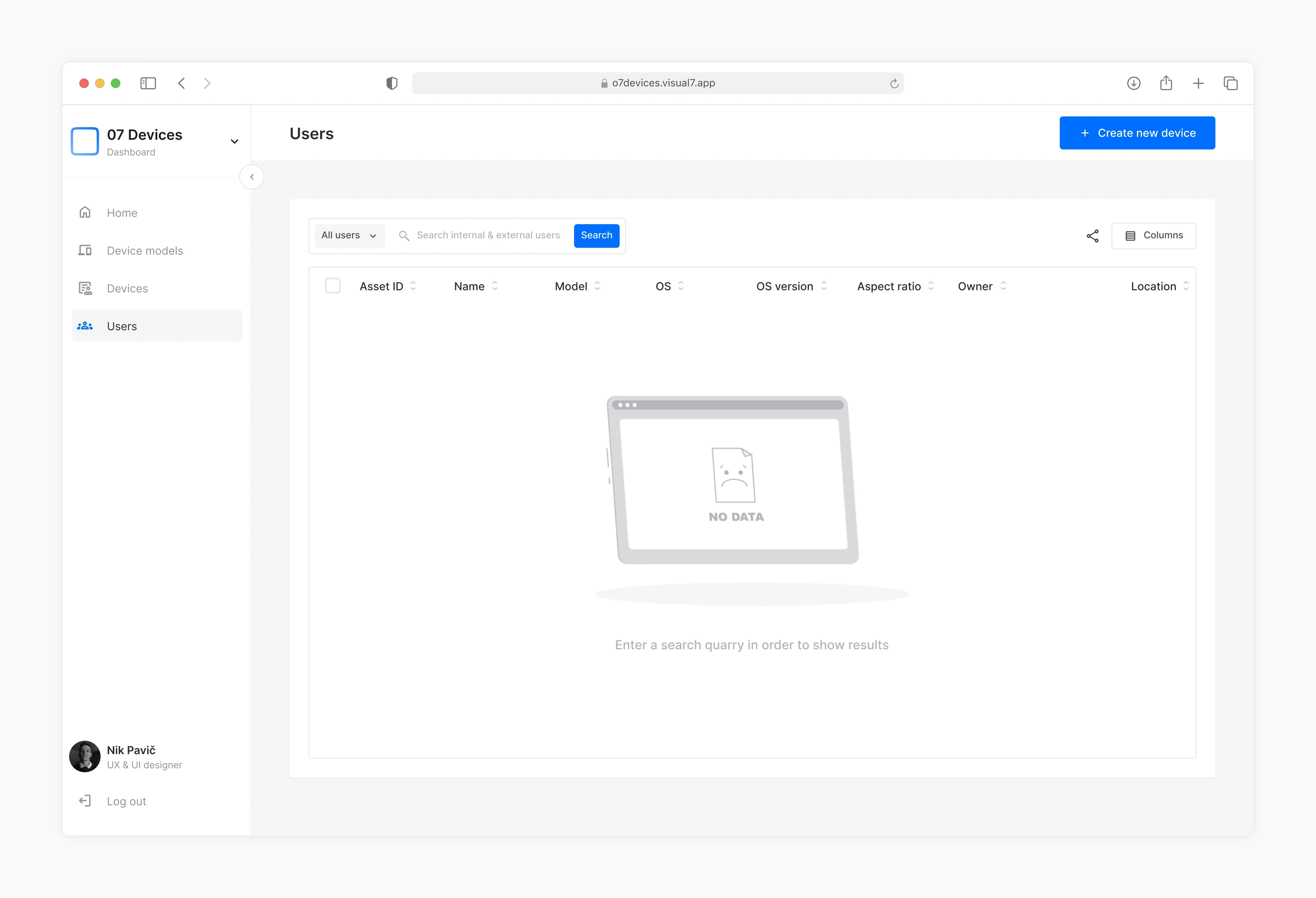
7.5 Blank state example.
IMAGE
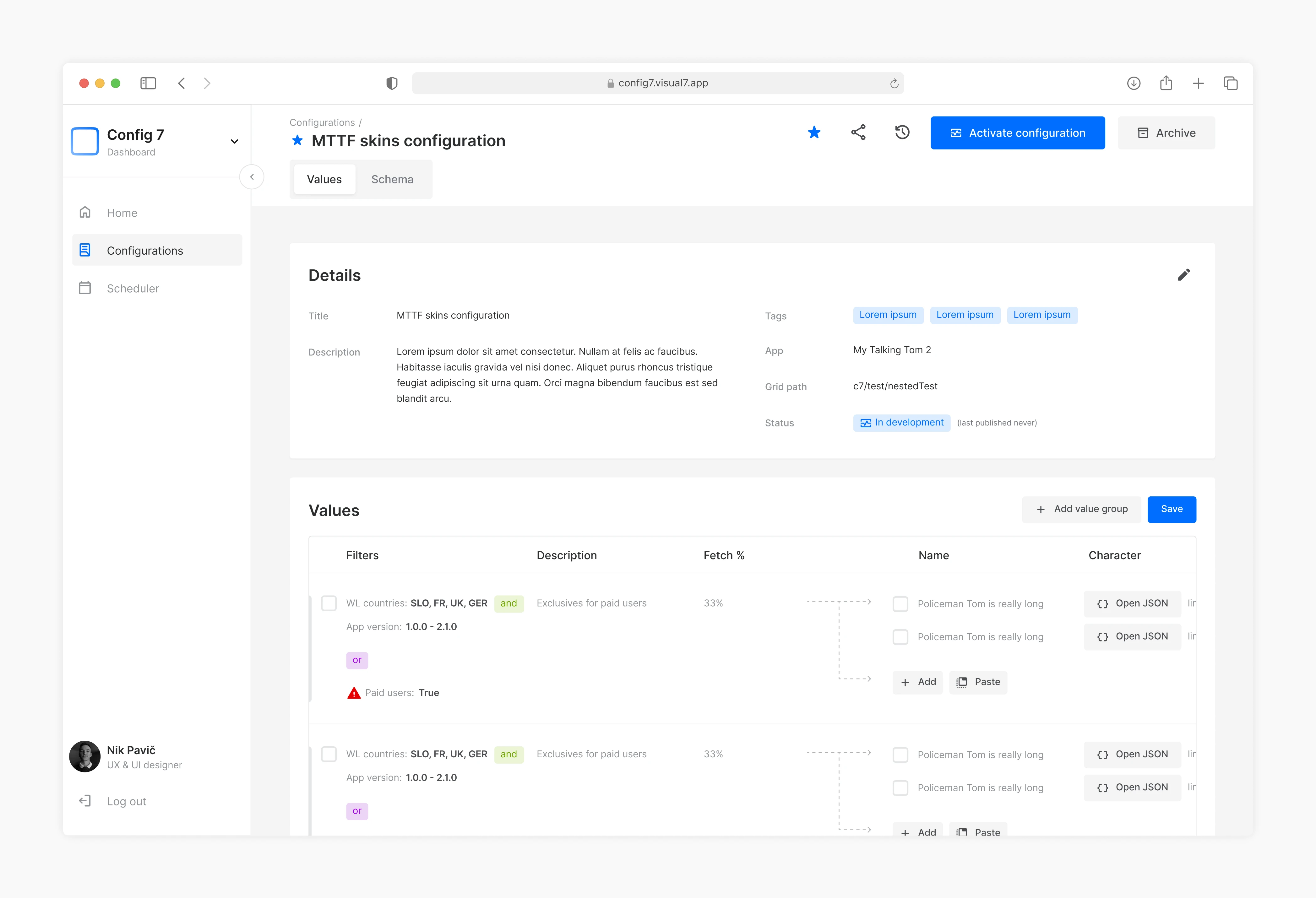
7.6 Configurations.
IMAGE
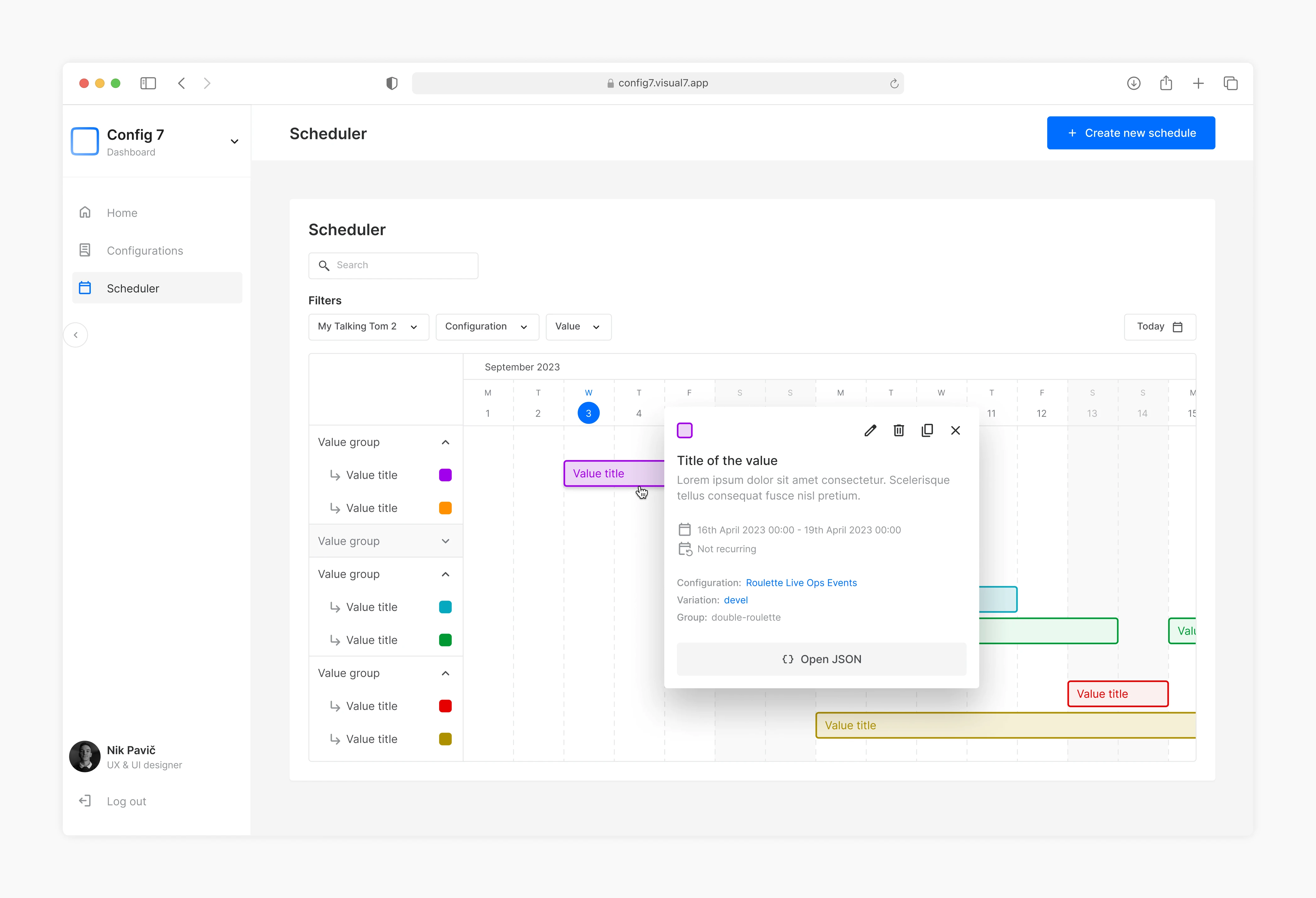
7.7 Scheduler.
IMAGE

7.8 Graph examples.
IMAGE
IMPACT AND LEARNINGS
Reflecting on outcomes and takeaways
Impact:
The creation of a design system brought consistency across all dashboards, ensuring a seamless user experience for those navigating multiple platforms. Simplifying complex workflows and introducing clear visual indicators made the CRM easier to use, boosting user confidence and efficiency.
Additionally, the modular components and comprehensive documentation established a scalable infrastructure, enabling future dashboard expansions without compromising quality.
Learnings
Involve cross-functional teams early – Collaborating with QA engineers during testing ensured that the product was user-centered and addressed real-world scenarios effectively. Involvement of all teams was key for success.
Simplicity through structure – Reducing complexity isn’t about removing steps but organizing them in a way that feels intuitive and manageable. Prioritizing structure led to a more approachable and error-free experience.
Available to work with you
Let’s design the
next one together

© 2025 Nik Pavič
Ljubljana, Slovenia